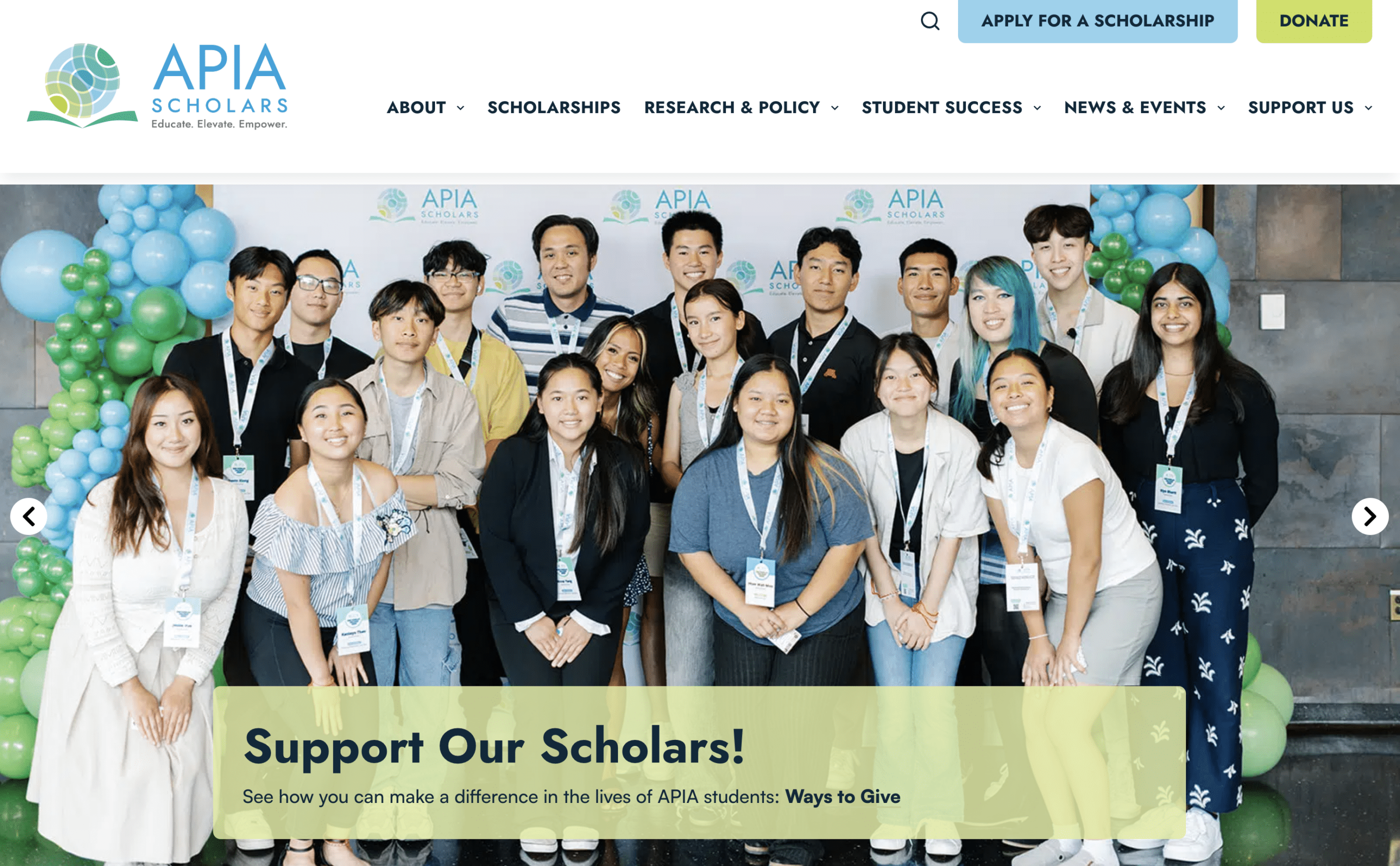
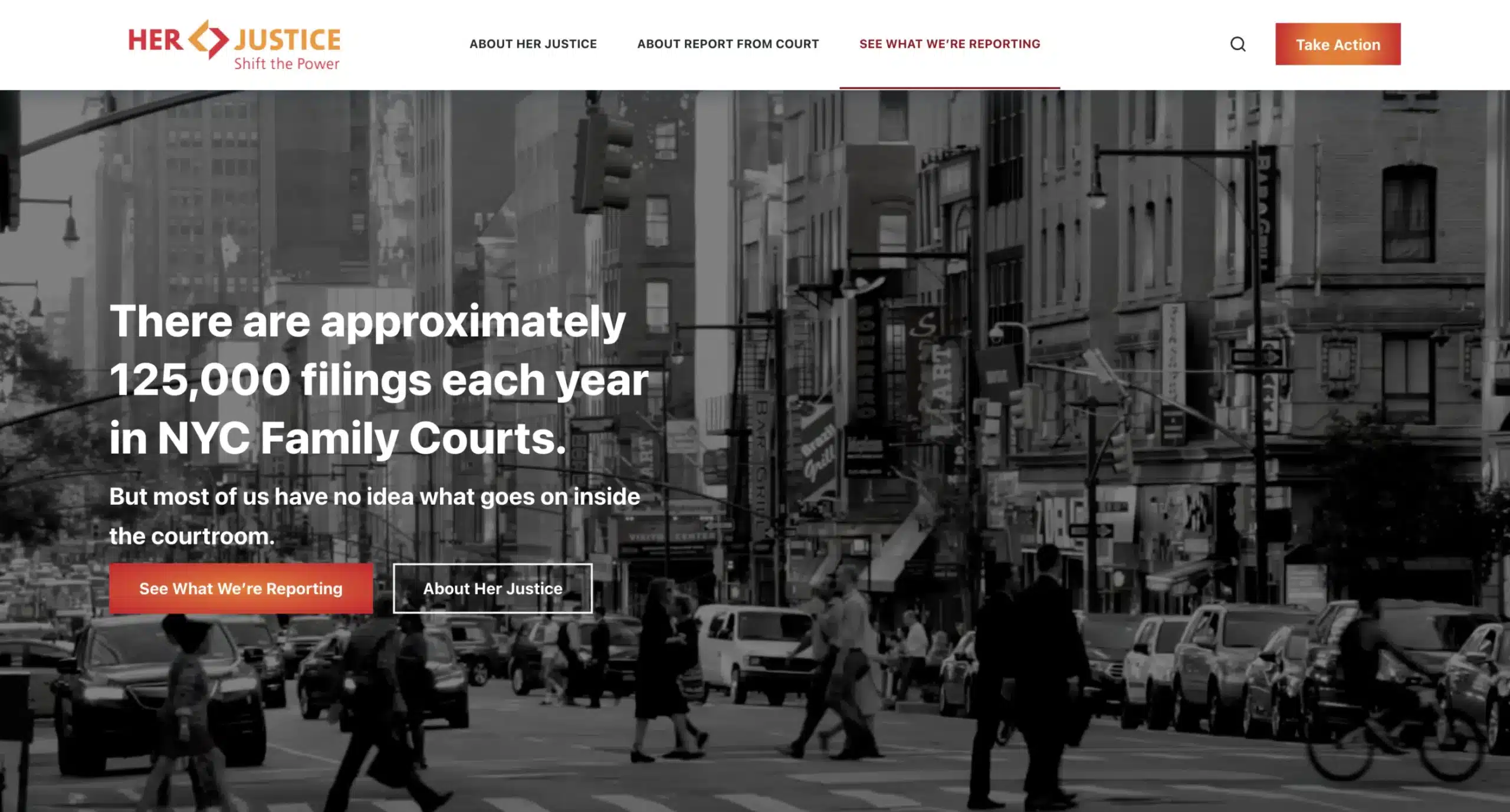
We were so thrilled to start our work with them and create a brand new nonprofit website that shows off their impact.
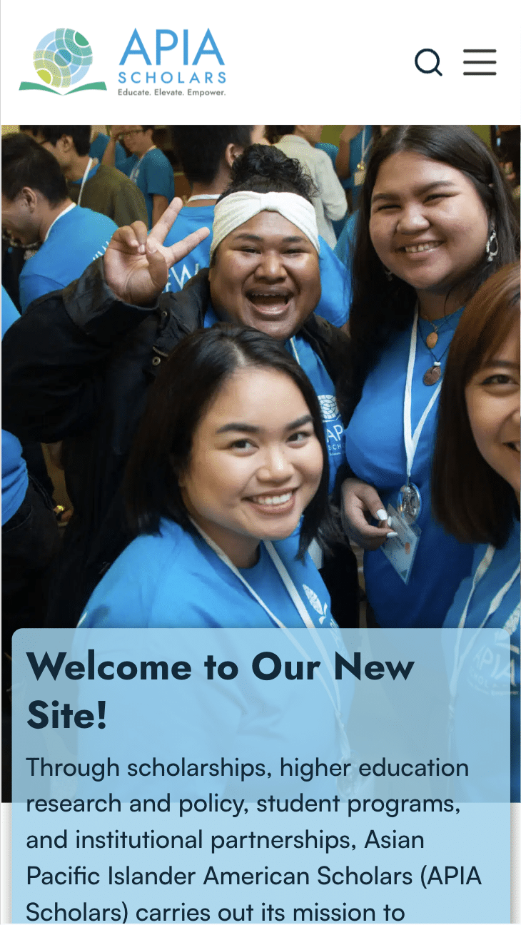
Their main focuses for this project, and some of the core aspects of our nonprofit website design principles, were to increase accessibility and user experience while developing a ton of great new custom features and updating the style of the site to a brand new design.
We developed their new site utilizing Blocksy, which allowed us to easily revamp their old design in a way that best fits their style as an organization, and brings it up to date with a great new look and that allows for greater flexibility and customization.
With their new build also came some special development features that enable them to provide a higher level of user experience and engagement: their new newsletter subscription button, logo slider, blog category filters, and updated contact form.
To increase engagement and provide users with an easy way to keep up-to-date with projects, events, and news from API Scholars, we created a newsletter signup button that presents a pop-up overlay that users can fill out that doesn’t disrupt the flow of the page. Now they have a great new call-out that better brings attention to their newsletter directly on the homepage that they can use across the site as well.
As an organization that works with so many partners to make higher education a reality for over 8,000 students, they wanted a way to showcase their tremendous number of partners and collaborators. We developed a solution that would highlight these partners in a logo slider in the footer across all pages.
On their old site, their resources and publications weren’t split into any categories, making information more difficult for users to find and damaging user experience. One of the main features on the new site is a blog category filtering system that splits their messages from the present, blogs, and reports into separate categories to allow for easier navigation and discovery of resources.
The last big feature we developed for the new site is the new contact form that uses ‘type of inquiry’ targeting where users can specify the reason they’re contacting the organization, which creates a more organized and efficient system on the back-end for their team to respond to requests, and allows for users to input more detail on their specific inquiry.
APIA Scholars’ new site prioritizes navigation, ease of access to resources and publications, and an updated design that makes it easier for students to find information on scholarships, and researchers and professionals to find publications and policy information. We’re delighted to have had the opportunity to collaborate with the APIA Scholars team on this project, ensuring their new site enhances user experience and continues to serve their community with greater efficiency and impact.

